

Copywriting
Photography
Appraising
Buchanan had worked with Haroon and Farouq the founding brothers since their float in 2005, so when they approached us to help commemorate their 25 years in business, we were delighted to get the brief to write and produce an anniversary book – the book would include the CareTech history, key events, a focus on the business inception and growth – interviews with past and present staff and affiliates, plus, a brief background to the Sheikh family.
ELEVATING
It was our plan that the process be as collaborative as possible and so at every step we’d share our progress with Haroon and Farouq. Given the breadth of resources and multiple stakeholders contributing to the book the planning and co-ordination needed to be smooth and time efficient. Following a six-step process of discovery, structure, creation, implementation, proofing and production we were able to devise a project schedule and timeline for delivery – which was their CareTech awards ceremony four months from kick-off. We would begin with an audit of existing assets both digital and physical, through to content creation; interviews and storyboarding, writing and design, page turns and proofing to wet proofs and print production.


Haroon Sheikh
Co-founder and Chief Executive Officer, CareTech Holdings
AMPLIFYING
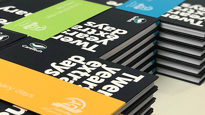
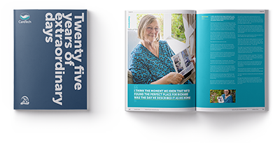
We created a +140 page silver anniversary hardback book capturing the Group’s story from establishment in 1993 to the nationwide network it is today. We commissioned both words and images to celebrate the people and events that were integral to the Group’s 25-year journey. Our purpose for the book was to chart a collective achievement over a quarter of a century, and to give the book true value for those who received it. We told the history of CareTech through the voices of some of the people who helped create it – from the most junior to the most senior.
Working hand-in-hand with the author and the photographer, our design solution reinterpreted key elements of the CareTech visual asset library. By tying CareTech’s coloured ribbons into dramatic typographic section dividers, we were able to subtly reinforce the book’s corporate source while allowing space for imagery and text to be appreciated. This also permitted greater control of the document’s pace and, at times poignant, visual impact.