Our workshops revealed not only how focused the organisation was but how committed it was to explaining its utility in the creation of an efficient and expert portfolio processing chain. Thus, we honed the name and visual identity to their most direct forms.
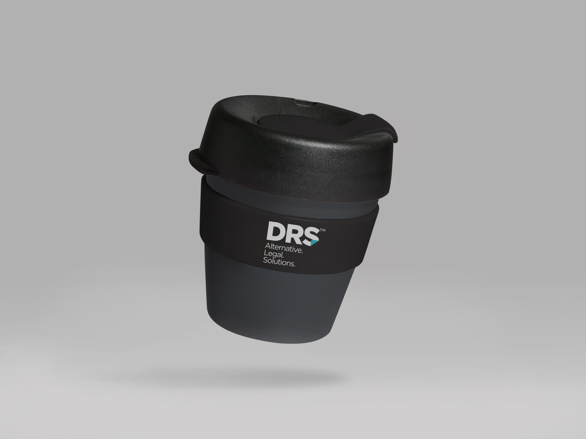
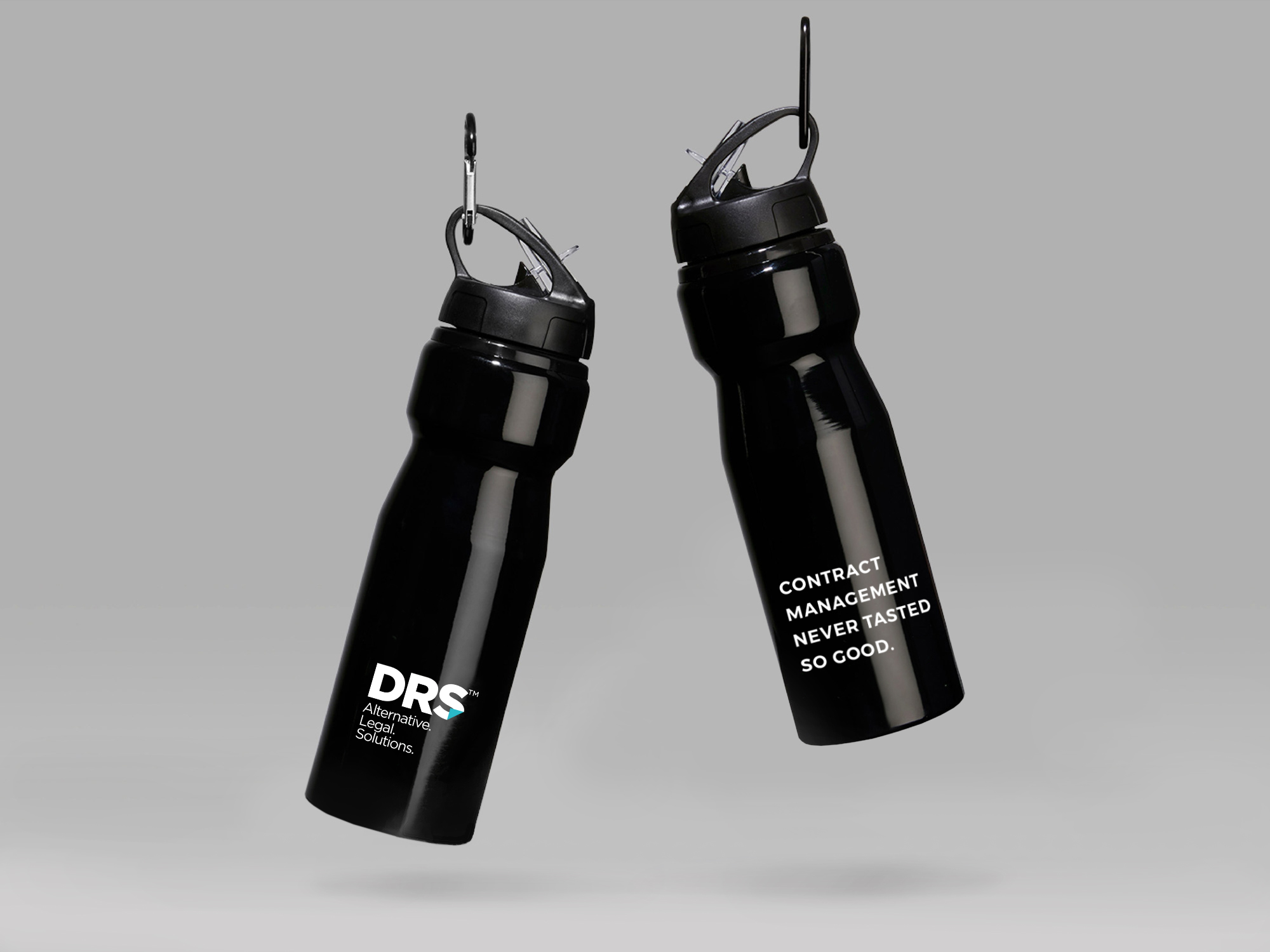
We simplified the mark to reinforce the initials and introduced a strapline that clarified their positioning. A simple triangular “page turn” was introduced within the logo as a nod to their stock-in-trade of paperwork.
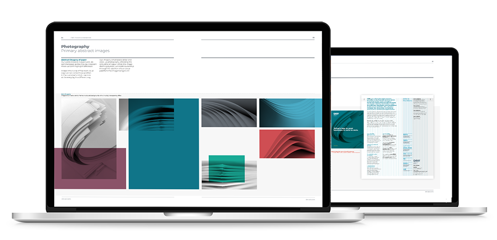
This concept was then explored more explicitly through abstract photography of reams of paper. These visual assets were put to work on all elements of the companies’ revised collateral – from internal announcements through to a new customer-focused website. Allied to this were revised headlines and copy that ensured the passion revealed in the brand workshops was communicated more concisely to their audiences.
An additional investment in a marketing function allowed DRS to carve a new place in the legal/financial services market which kicked off with a brand launch for internal stakeholders.